
How to build a Next.js project with the new app directory, Flowbite, and deploy it to Vercel


This article will guide you through the initial stages of creating a web application using Next.js, Tailwindcss, and Flowbite. We will use the newly introduced app directory features by Next.js in order to construct our application. Upon completion of this tutorial, the final product will be deployed to Vercel for testing the seamless integration. This tutorial aims to provide a solid foundation for future web development projects, allowing you to quickly navigate through the initial steps.
Technology Overview
Next.js
Next.js is an extremely popular React framework used for building server-rendered React applications. The framework offers tons of advanced features, such as built-in routing, server-side rendering, and image optimization, making it a go-to choice for many web developers.
The new app directory in Next.js provides several features to enhance the development process:
Layouts: Allows for easy sharing of UI between different routes while maintaining state and minimizing costly re-renders.
Server Components: Prioritizes server-first rendering for dynamic applications.
Streaming: Enables instant loading states and streaming of UI components as they are rendered.
Data Fetching Support: Provides async Server Components and an extended fetch API for component-level data retrieval.
You can read more about the new features here.
Flowbite
Flowbite is a UI library built on top of the utility-first Tailwind CSS framework. It offers the simplicity and flexibility of Tailwind while providing pre-built UI components and building blocks that can significantly speed up the development process.
Vercel
Vercel, a cloud-based platform, is an ideal choice for deploying and hosting web applications. It offers a variety of powerful features, such as continuous integration and deployment, preview mode, serverless functions, and middleware. By using Vercel, developers can avoid the need for configuring the underlying platform, allowing them to concentrate solely on developing their applications and enjoying the benefits.
Project setup
Prerequisites
Make sure that you have Node.js (v16.8.0 or later) installed on your computer to be able to install Next.js, Tailwind CSS, and Flowbite using NPX and NPM.
Create a new project
To automatically create a Next.js project with the app directory you need only run the following command:
npx create-next-app@latest --experimental-app
cd next-experimental
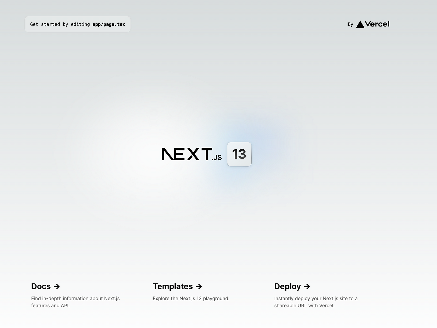
During the installation process, you will be prompted to provide a name for your project and to choose between using TypeScript (highly recommended) or Eslint (also recommended). Once the installation is complete, your basic project will be ready to use. To build the app, you can use the following command.
npm run build
or run in development mode
npm run dev
Voila, our beautifully running application
Install TailwindCSS
After the project creation steps, we will install TailwindCSS based on the official documentation.
npm install -D tailwindcss postcss autoprefixer
npx tailwindcss init -p
The first command will install the necessary dependencies, while the second command will initiate the Tailwind framework within the project. This will automatically generate two configuration files, tailwind.config.jsand postcss.config.js. The next step is to make the necessary changes in the tailwind.config.js file as outlined in the following instructions.
/** @type {import('tailwindcss').Config} */
module.exports = {
  content: [
    "./app/**/*.{js,ts,jsx,tsx}",
    "./pages/**/*.{js,ts,jsx,tsx}",
    "./components/**/*.{js,ts,jsx,tsx}",
  ],
  theme: {
    extend: {},
  },
  plugins: [],
}
Then replace the global.css content with the @tailwind directives
@tailwind base;
@tailwind components;
@tailwind utilities;
And finally, we will replace the content of the Home component in the app/pages.tsx file to see the result of the Tailwind library configuration. Additionally, the page.module.css file can be removed as it will not be needed, as we will be using only tailwind classes.
// page.tsx

export default function Home() {
  return <h1 className="text-3xl font-bold underline">Hello world!</h1>;
}
Install Flowbite React
First, install the Flowbite and Flowbite React packages
npm install flowbite flowbite-react --save
The next step is to add Flowbite as a plugin to the tailwind.config.js file and extend the content paths to ensure that the dynamic classes provided by Flowbite will be included during the compilation process.
/** @type {import('tailwindcss').Config} */
module.exports = {
  content: [
    './node_modules/flowbite-react/**/*.js',
    './app/**/*.{js,ts,jsx,tsx}',
    './pages/**/*.{js,ts,jsx,tsx}',
    './components/**/*.{js,ts,jsx,tsx}',
  ],
  theme: {
    extend: {},
  },
  plugins: [require('flowbite/plugin')],
};
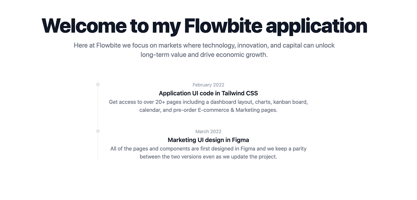
Now let’s add some Flowbite components to the home page to confirm that the installation was successful. You can refer to Flowbite Blocks for inspiration or go through the Flowbite React components. If you have followed the instructions correctly and started the development server, you should now be able to see the Flowbite components in the browser.
// components/timeline.tsx

'use client';

import { Timeline as FbTimeline } from 'flowbite-react';

export const Timeline = () => (
  <FbTimeline>
    <FbTimeline.Item>
      <FbTimeline.Point />
      <FbTimeline.Content>
        <FbTimeline.Time>February 2022</FbTimeline.Time>
        <FbTimeline.Title>Application UI code in Tailwind CSS</FbTimeline.Title>
        <FbTimeline.Body>
          Get access to over 20+ pages including a dashboard layout, charts, kanban board, calendar, and pre-order
          E-commerce & Marketing pages.
        </FbTimeline.Body>
      </FbTimeline.Content>
    </FbTimeline.Item>
    <FbTimeline.Item>
      <FbTimeline.Point />
      <FbTimeline.Content>
        <FbTimeline.Time>March 2022</FbTimeline.Time>
        <FbTimeline.Title>Marketing UI design in Figma</FbTimeline.Title>
        <FbTimeline.Body>
          All of the pages and components are first designed in Figma and we keep a parity between the two versions even
          as we update the project.
        </FbTimeline.Body>
      </FbTimeline.Content>
    </FbTimeline.Item>
  </FbTimeline>
);
// app/page.tsx

import { Timeline } from '../components/timeline';

export default function Home() {
  return (
    <div className="bg-white dark:bg-gray-900">
      <div className="py-8 px-4 mx-auto max-w-screen-xl text-center lg:py-16 lg:px-12">
        <h1 className="mb-4 text-4xl font-extrabold tracking-tight leading-none text-gray-900 md:text-5xl lg:text-6xl dark:text-white">
          Welcome to my Flowbite application
        </h1>
        <p className="mb-8 text-lg font-normal text-gray-500 lg:text-xl sm:px-16 xl:px-48 dark:text-gray-400">
          Here at Flowbite we focus on markets where technology, innovation, and capital can unlock long-term value and
          drive economic growth.
        </p>

        <div className="py-8 max-w-screen-sm mx-auto">
          <Timeline />
        </div>
      </div>
    </div>
  );
}
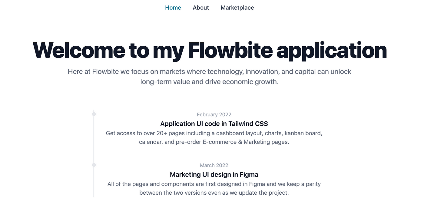
Although we will not cover the new features of Next.js 13 in this tutorial, one of the things we can easily experiment with is the use of the layout.tsx file. Let’s create a simple header component in the components/header.tsx file. The first use client line in the file indicates that Next.js should only render this component on the client side, as the use of usePathname doesn’t work on the server side.
// components/header.tsx

'use client';

import Link from 'next/link';
import { usePathname } from 'next/navigation';

const LINKS = [
  { name: 'Home', href: '/' },
  { name: 'About', href: '/about' },
  { name: 'Marketplace', href: '/marketplace' },
];

export const Header = () => {
  const pathname = usePathname();

  return (
    <header>
      <nav className="bg-white border-gray-200 py-2.5 dark:bg-gray-800">
        <div className="flex flex-wrap justify-center items-center mx-auto max-w-screen-xl">
          <ul className="flex flex-col mt-4 font-medium lg:flex-row lg:space-x-8 lg:mt-0">
            {LINKS.map((link) => {
              const isActive = link.href === pathname;
              return (
                <li key={link.name}>
                  <Link
                    href={link.href}
                    className={`block py-2 pr-4 pl-3 ${
                      isActive ? 'text-primary-700' : 'text-gray-700'
                    } border-b border-gray-100 hover:bg-gray-50 lg:hover:bg-transparent lg:border-0 lg:hover:text-primary-700 lg:p-0 dark:text-gray-400 lg:dark:hover:text-white dark:hover:bg-gray-700 dark:hover:text-white lg:dark:hover:bg-transparent dark:border-gray-700`}
                    aria-current="page">
                    {link.name}
                  </Link>
                </li>
              );
            })}
          </ul>
        </div>
      </nav>
    </header>
  );
};
Then we will add the following lines to the app/layout.tsx file
// app/layout.tsx

import './globals.css';
import { Header } from '../components/header';

export default function RootLayout({ children }: { children: React.ReactNode }) {
  return (
    <html lang="en">
      <head />

      <body>
        <Header />
        <div className="bg-white dark:bg-gray-900">
          <div className="py-8 px-4 mx-auto max-w-screen-xl text-center lg:py-16 lg:px-12">{children}</div>
        </div>
      </body>
    </html>
  );
}
And let's create two more pages, About and Marketplace
// app/about/page.tsx

export default function About() {
  return (
    <h1 className="mb-4 text-4xl font-extrabold tracking-tight leading-none text-gray-900 md:text-5xl lg:text-6xl dark:text-white">
      About
    </h1>
  );
}
// app/marketplace/page.tsx

export default function Marketplace() {
  return (
    <h1 className="mb-4 text-4xl font-extrabold tracking-tight leading-none text-gray-900 md:text-5xl lg:text-6xl dark:text-white">
      Marketplace
    </h1>
  );
}
As a result, we have header components on every page we created and we can navigate through our small application.
Deploy to Vercel
Now that our application can be run locally, it is time to make it accessible to a wider audience. One of the most convenient ways to deploy a Next.js app is through Vercel. To begin, you will need to create a Vercel account, which can be easily done on their website.
Create the project on Vercel
There are several options for creating a project on Vercel, such as importing it from Github, creating one from a template, or using the Vercel CLI. In this case, we will be using the Vercel CLI, so it will need to be downloaded first.
npm i -g vercel
After the installation is complete, you can use this command to check the installed version
vercel --version
Deploy the app
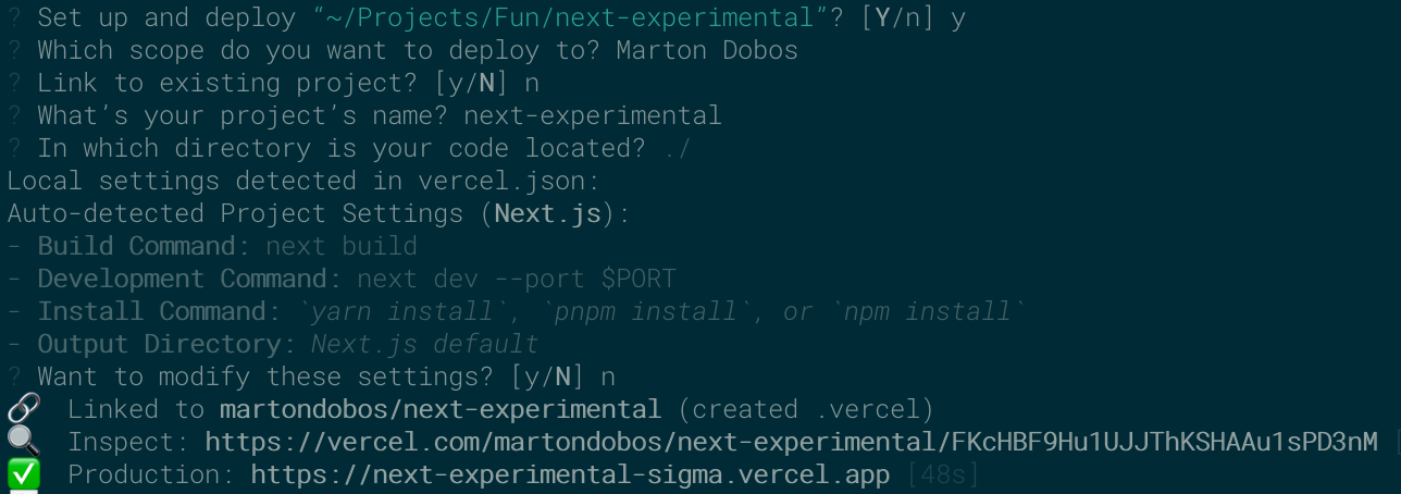
The next step is to link our project to Vercel using the following command.
vercel
You’ll need to log in to your Vercel account, then press ‘Y’ to confirm that you want to set up and deploy the project. After answering a few prompts (you can use the default answers if you’ve been following this tutorial), the link to the deployed page will be displayed in the terminal. You can use the “Inspect” link to view the build process and troubleshoot any errors that may occur.
Summary
Web development is a fascinating field, with a vast array of tools available to make the developer’s life easier. This tutorial provided an overview of the process of building a Next.js website from the ground up and deploying it to the cloud. Additionally, by using an easy-to-use styling tool and UI library, we were able to add visually appealing components to our simple web app. The availability of existing libraries and service providers enables rapid iteration of ideas and features, making the experience of creation even more satisfying. As we move forward, we can continue to build more complex applications with confidence, knowing that the tools and resources at our disposal will allow for efficient and effective development.